
Case Studies

Designing the digital first impression a local service business actually needs.

A concept build showing how a South Florida service business could present itself online with clarity and trust.

Type
Independent concept
Sector
Home services
Primary pillar
Stronger digital experiences

Concept disclosure

Independent concept created to demonstrate LeadSink’s approach. Not a client engagement; no performance results are claimed.

The thesis

A homeowner comparing local providers on a phone decides in seconds. This concept is built around what they need to see, in the order they need to see it.

The build is small on purpose. It exists to show that the digital first impression for a local service business isn’t a design problem, it’s an ordering problem: what the visitor needs to confirm, and in what sequence, before they’ll act.

The opportunity

Most local service sites lose the visitor before they read a word.

Sites in this category tend to bury the services, hide the phone number, and leave the visitor guessing whether the company works in their neighborhood. Prospects bounce and quietly call whoever is clearer.

The concept assumes a specific visitor and designs the whole experience around what that visitor needs to confirm, in the order they’ll actually check for it.

The visitor

  • A homeowner comparing local providers quickly, usually on a phone.
  • Motivated by a specific problem, not shopping around casually.
  • Weighing whether the company performs the right service.
  • Confirming the company works in their area before anything else.
  • Checking whether the operation looks legitimate.
  • Willing to request a quote only if the ask feels easy.

“Do you do this, do you come here, and how do I ask?”

The strategic insight

The concept doesn’t compete on visual style. It competes on how quickly the visitor can confirm the right service, the right area, and an easy next step.

Lead with service and location, keep the quote action within thumb reach, and let credibility do the rest.

The visitor sequence

One decision, five confirmations.

The layout is built so a homeowner moves through the same five confirmations in the same order, whether they land on the homepage or a service page.

  1. 01

    Recognize the service

  2. 02

    Confirm the area

  3. 03

    Read like a neighbor

  4. 04

    Scan the services

  5. 05

    Request the quote

Decision, why, evidence

The reasoning behind the concept.

Each choice is intentional. Here is what was decided, why, and how it shows up on the live concept.

Lead with service and location

Why

A homeowner on a phone gives a site a few seconds. Relevance has to be obvious before anything else can matter.

Evidence

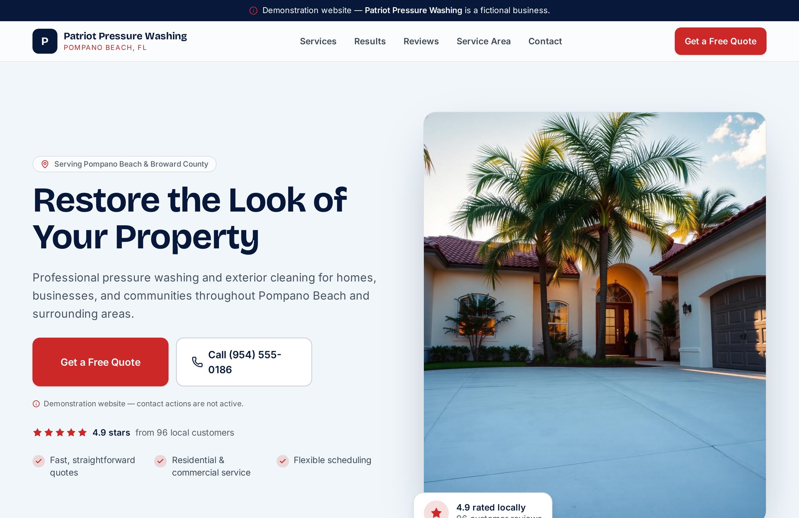
The hero states what the company does and where it works, with no scrolling required to confirm both.
Keep the quote action within thumb reach

Why

The conversion moment isn’t at the bottom of the page. It happens wherever the visitor decides they’re interested.

Evidence

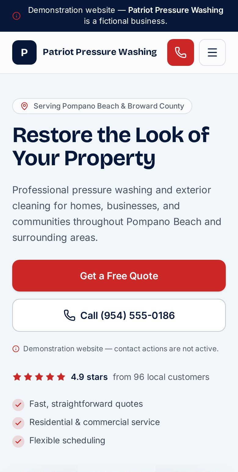
A quote request stays visible throughout the mobile experience so the next step is never more than one tap away.

Use neighborly language

Why

Homeowners hire people they trust. Agency-style superlatives create distance; plain, direct language reduces it.

Evidence

Copy reads like an owner talking to a neighbor across a fence, not a marketing page reciting features.

Structure services for scanning

Why

Visitors don’t read carefully on the first pass. Services have to be recognizable at a glance or they get skipped.

Evidence

Services are broken into short, distinct blocks with clear labels, so a homeowner can find the one they need without reading everything.

Place trust information before asking for commitment

Why

Requesting a quote is a small commitment, but it still requires a reason to believe the company is legitimate.

Evidence

Credibility signals sit above the quote-request moments so the ask never comes before the reason to trust it.

What the concept shows

The desktop and mobile views, built to the same logic.

The live concept is public. Open it on a phone to see how the visitor sequence holds together in the environment most homeowners actually use.

Homepage of the Patriot Pressure Washing concept website.
Desktop concept
Mobile view of the Patriot Pressure Washing concept website homepage.

Mobile view

ConceptWebsitePositioningMobile-first

The capability this proves

The concept demonstrates the discipline behind LeadSink’s approach to a digital first impression: define the visitor before the design, order the page around what they need to confirm, and keep the next step in reach the entire way. The result is a small, defensible site any local service business in this category could adapt and be proud of.

Want something like this?

Let’s talk about what your customers actually see.

Send your current site and a few words about the business. We’ll come back with an honest read.